Designing Desktop Neo
During the creation of Neo, I put a big focus on research. I looked at the evolution of GUIs across platforms, alternative concepts and patent applications. I continually analyzed jobs-to-be-done, target groups and user flows. A large part of the process was defining the problems and iterating solutions on paper. Early on, I identified the three most important topics as navigation, file management and input.
Some of the concepts presented were clear from the start, but many were only implemented near the end, or completely redone multiple times in the process. They went through many conceptual and visual iterations before arriving at their current stage. Below are some impressions of the work that went into them.
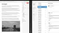 Panel view with previous Pages and Mail app mockups.
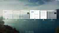 First mockup of standalone panel management.
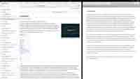 Experiments with browsing tagged websites and entering tags.
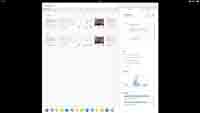 An early Finder with a dock and different sidebar widgets.
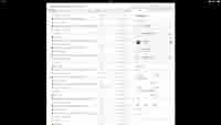 Exploration of searching with tags and the interface for smart tags.
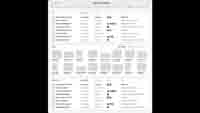 One of the earliest mockups of Neo, focused on files and search.
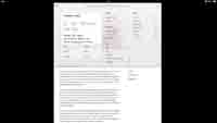 The app menu started life as a dropdown panel with a document card.
I will soon be writing in more detail on my blog about some iterations and how I ended up with the current version. You can also follow me on twitter to get updates on Neo.
The applications depicted in Neo are not associated with the concept. Their icons and names are neither owned nor created by me.


