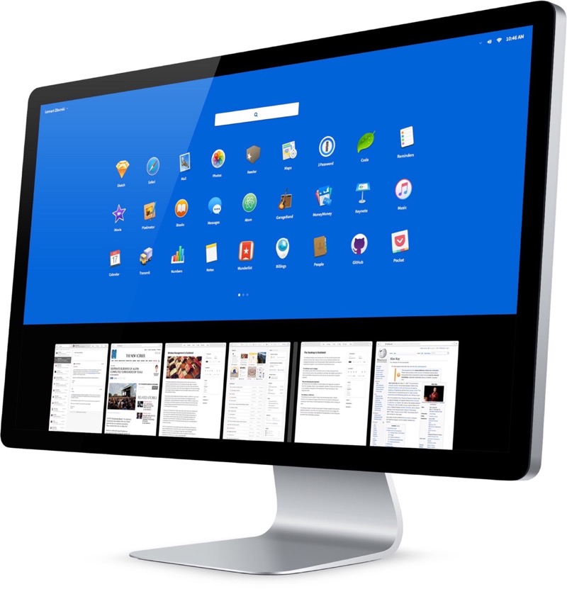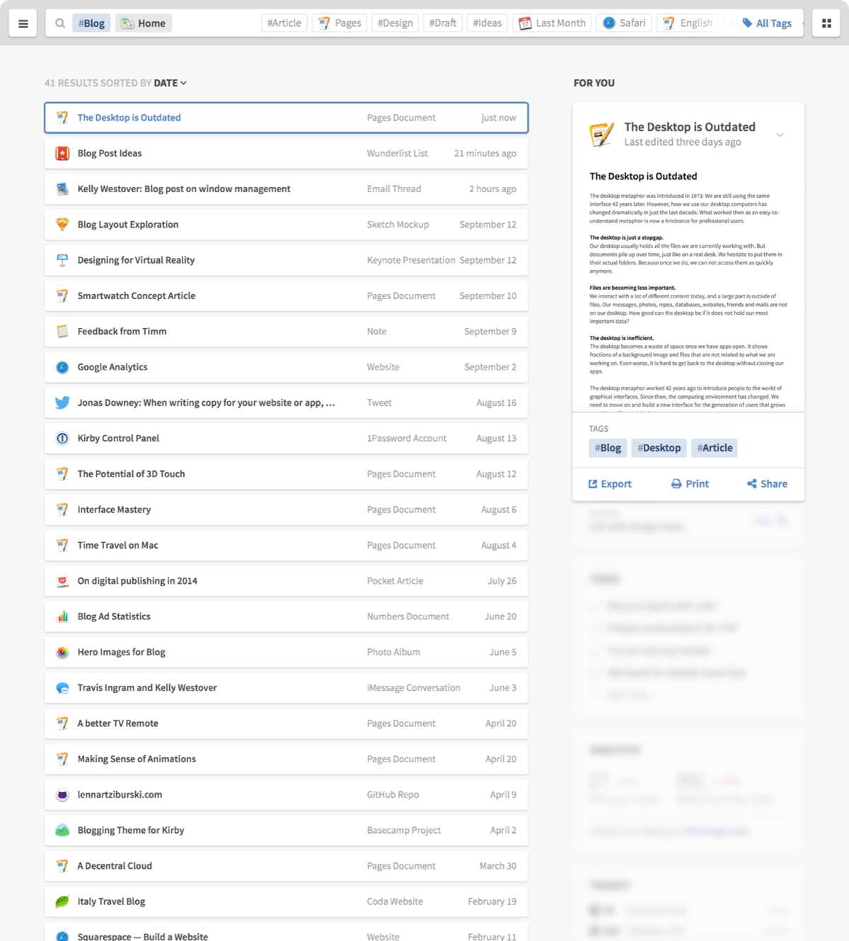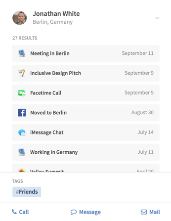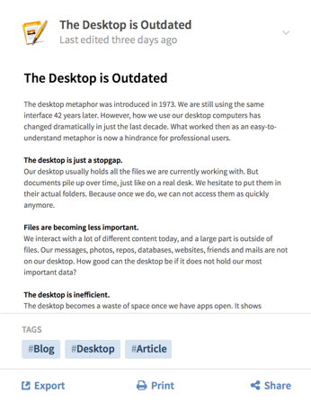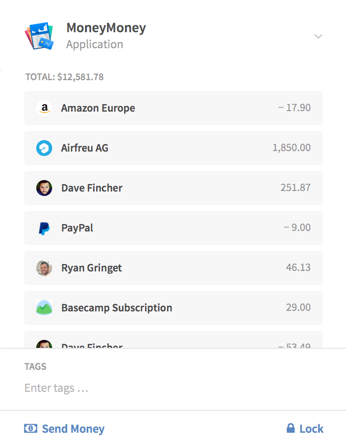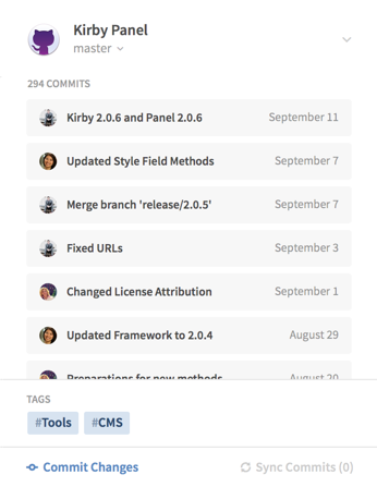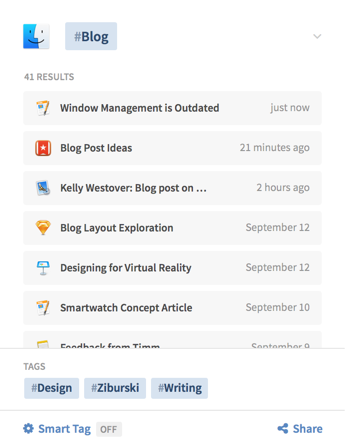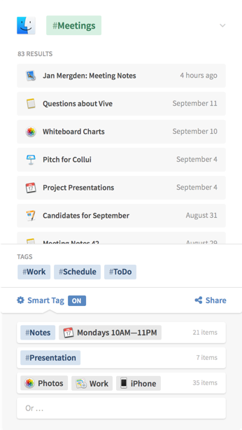
The desktop computer hasn’t changed much in the last 30 years. It’s still built on windows, folders and mouse input. But we have changed. We now use smartphones and tablets most of the time, since they are much easier to use.
The traditional desktop computer is struggling to adapt the simple interfaces of mobile devices while also keeping its focus on productivity. With people switching to mobile devices for mundane tasks, we have the opportunity to rethink the desktop computer with a focus on getting professional work done.
Neo is a conceptual desktop operating system interface that is built for todays people, needs and technologies. Visualized below are ideas that were designed to inspire and provoke discussions about the future of productive computing. I have no intention of taking this beyond the concept stage. However, I am putting my work out there hoping that people build upon it.
Your whole screen for easy multitasking.
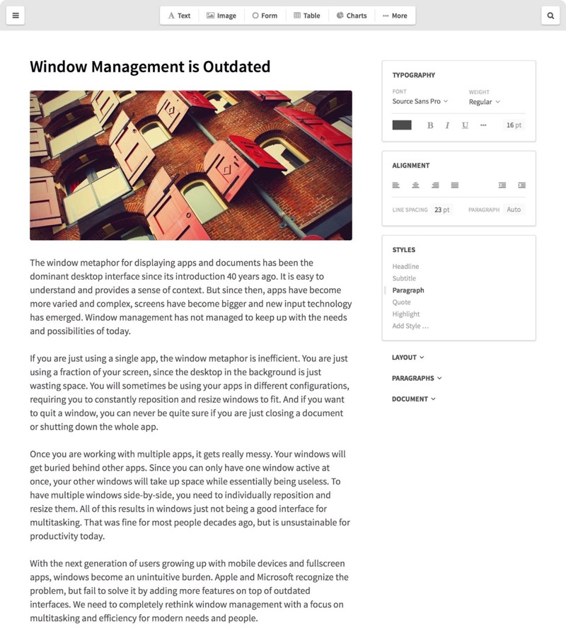
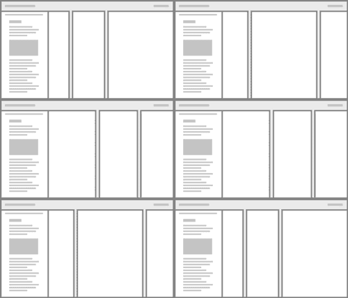
Neo shows your apps as panels. They fill the full height of your screen and are placed next to each other without overlap. You can have dozens of panels open and easily scroll through them to switch between apps. Or resize and move them to work with multiple apps side-by-side.
Panels use screen space more efficiently and are a more elegant way to multitask than normal windows.
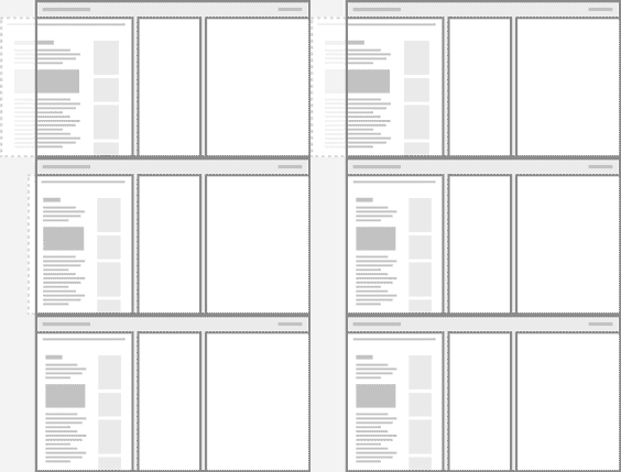
Fit
Resize a panel to fit within your screen by just clicking on its edge.
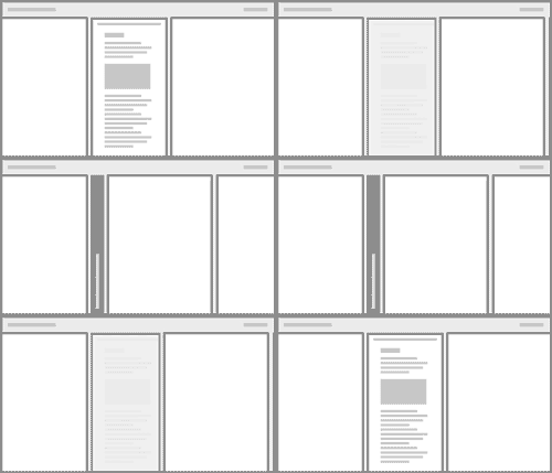
Minimize
Minimize panels to save space while still getting a peek at the app.
Pin
Pin a panel to your screen to keep it on top while switching apps.
-
![]()
Scroll through panels
drag left or right
with 3 fingers -
![]()
Open App Control
drag down
with 3 fingers -
![]()
Open an apps menu
click on the panel
with 3 fingers -
![]()
Open a Finder panel
click and drag up
with 3 fingers -
![]()
Close a panel
click and drag it down
with 3 fingers -
![]()
Resize panels
click and drag between panels
with 3 fingers -
![]()
Fullscreen
click and drag outwards on a panel
with 6 fingers -
![]()
Minimize
click and drag inwards on a panel
with 6 fingers
See and click.
Neo tracks your eye gaze, so you don’t have to point with a mouse cursor before clicking. Gaze tracking hardware has become a lot better, smaller and cheaper over the last few years. It can be built in alongside a webcam. However, gaze tracking is obviously still not as precise as traditional mouse input. We can work around that by using a touchpad as a secondary input.
Whenever you put a finger on the touchpad, your current gaze selection is highlighted. If necessary, you can easily adjust the selection by moving your finger. Then just press down to click. This is comparable to the hover effect on the web. It’s much faster and easier than using a mouse, while still being precise enough for most tasks.
Select
Touch to select what you are looking at.

Adjust
Swipe to adjust your selection.

Click
Click to confirm your selection.

Focus Mode
When your eyes are focused on a single panel for more than a minute, other panels slowly fade into the background. They instantly pop back if you look at them.
Just Type
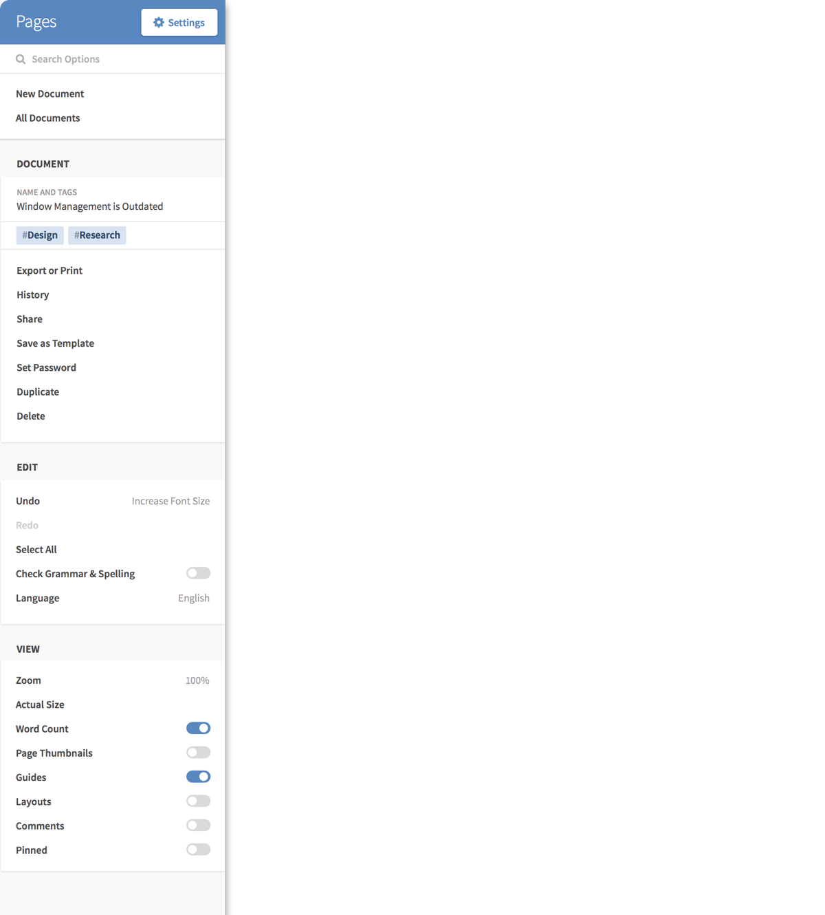
Just type while looking at an email to reply to it. Or type while looking at a search field to search. Neo knows the context of what you want to do without unnecessary interactions.
Preloading
Before you decide to click on something, your gaze usually focuses on it for a short moment. That’s often enough to start preloading content in the background and substantially improve load times.
Identify Users
Every person has a unique eye movement pattern. Combined with other sensors, this can be used for identifying users and security.
Notifications
Neo automatically dismisses incoming notifications after you look at them. You don’t have to swipe them away.
A large touchpad is the perfect partner for gaze input. You can use it to select, scroll, zoom and more wherever you are looking. And for really precise input, you could use devices like Apple Pencil on the touchpad.
Use one finger to interact with whatever you are directly looking at. With two fingers, you can scroll or zoom inside a panel. And three fingers let you modify and switch between panels.
Hey Siri, get back to work!
Voice input is a great fit for desktop interfaces. You are usually in a more personal and less noisy environment when working, and the tasks you do are more complex. That’s where voice input shines. With voice, you can access every possible command at any time – without going through a menu. You can reference elements that are not visible on screen and you can easily chain multiple commands together. And since Neo tracks your gaze, you can also reference what you are looking at.
Just press the voice key on your keyboard and start talking. Neo shows results in the bottom left corner of your screen without disrupting your workflow. Voice input has much more potential than the basic virtual assistants on our phones. On the desktop, it should be focused on helping us do work, not on witty conversations that take over the whole screen.


Conclusion
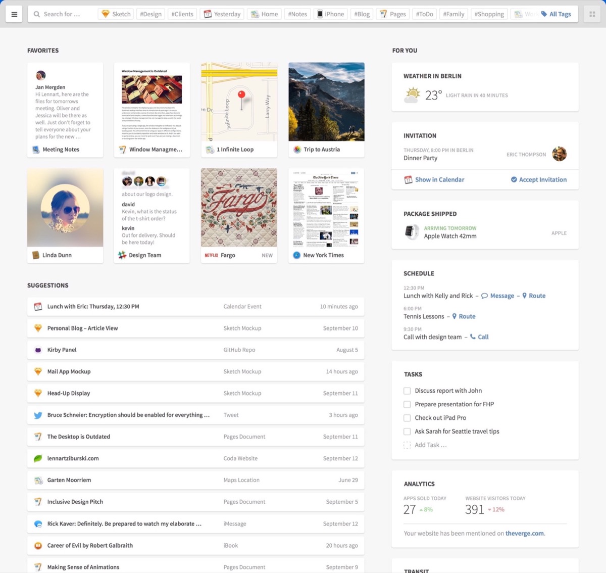
Neo rethinks desktop computing for productivity and efficiency. With panels, you can use your whole screen for easy multitasking and the new Finder is a quick way to the information you need. Tags, filters and content cards let you find and manage all your content without rigid folders. Gaze, touch and voice input enable easier and more efficient interactions, like the new context menu.
I hope Neo helps you imagine the possibilites of a desktop interface designed for the people and needs of today. We need more people to think about the future of the desktop. So please do tell your friends about Neo, and share it on Twitter or Facebook.
Design Process
The process of designing Desktop Neo involved a lot of research, prototyping and iteration. I analyzed jobs-to-be-done, target groups and user flows. You can learn a bit more about the design process, previous iterations and the tools I used on the 'Design Process' page.
Contribute
Improving the ways we work with our computers is an important part of our future. Neo barely scratches the surface of the problems and possibilites that exist in this space. So I would love to see your ideas about the future of work computing. I am always happy to chat, so please do get in touch. I am also releasing this concept and source files under a CC license and am collecting open questions and interesting work on the 'Contribute' page.
Blog Posts
I am constantly sharing more thoughts and in-depth breakdowns of Desktop Neo on my blog. You can also follow me on twitter to stay updated.
Discussions
Desktop Neo sparked great discussions about the future of desktop computing on Hackernews, Designernews, The Verge and The Next Web.
Press
If you would like to write about Desktop Neo, please feel free to quote my writing. If you would like to use high-resolution images, I’m happy to provide those and any other information by email.
Thanks
Thanks to Frank Rausch and Timm Kekeritz from Raureif and Prof. Matthias Krohn from FHP for their extensive support and feedback.

